Style Guide
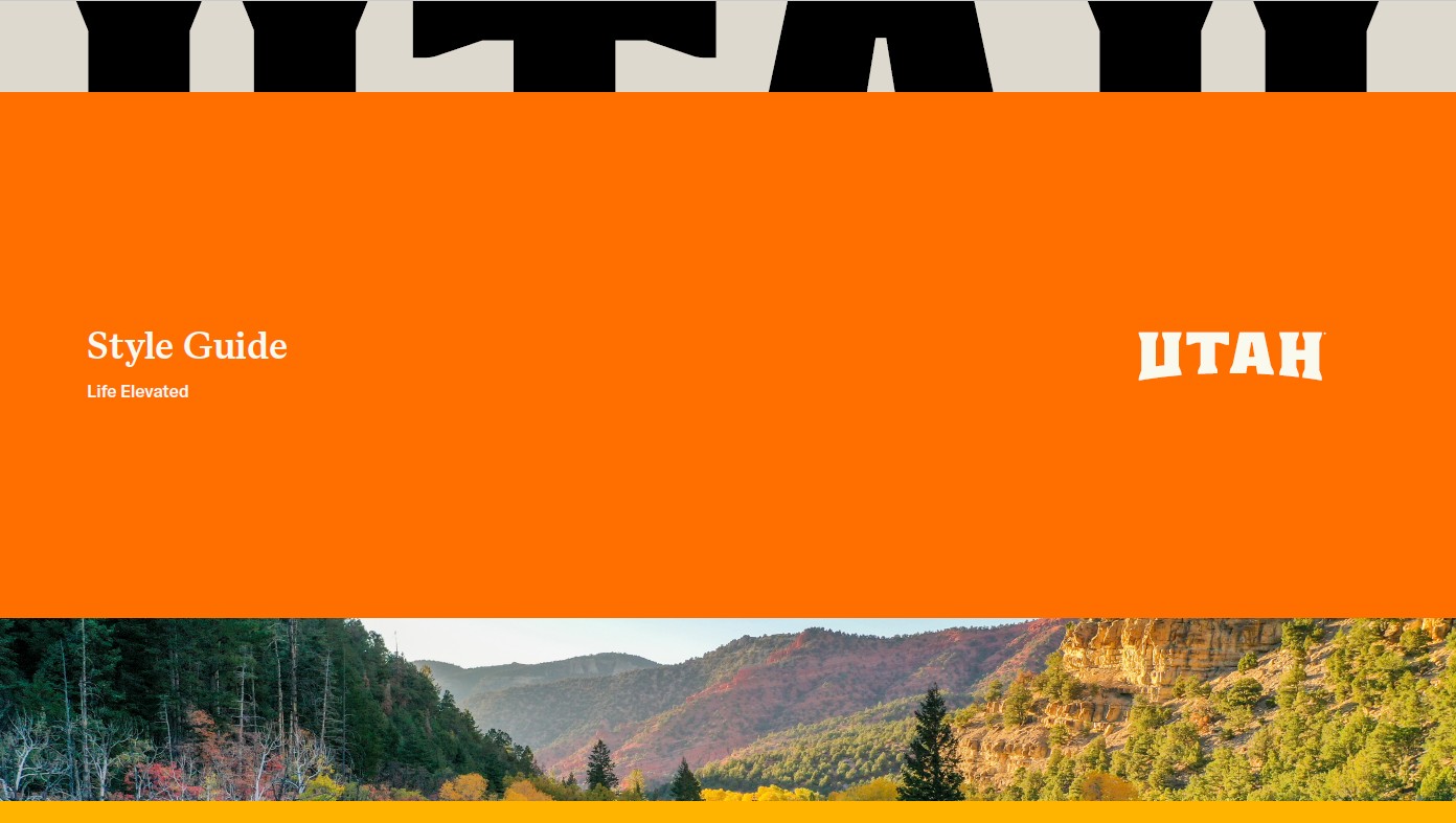
Utah Life Elevated® Style Guide
The state of Utah is built on a foundation of rock—granite peaks, carved sandstone, and dramatic shifts in elevation. The refreshed Utah logo continues to draw from this landscape, expressing strength, permanence, and ascent rooted in the state’s natural character. The letters evoke mesas, mountains, and arches—solid and substantial landforms that create the visual rhythms people have come to associate with this place.
The logo evokes Utah’s defining landforms through bold, grounded letterforms. This refreshed design sharpens these ideas with more vertical proportions, clearer geometry, and increased openness, reinforcing elevation while improving legibility in an updated context. Subtle reference to the Old West remains, now expressed through wedge serifs and more uniform stroke weights that balance heritage with a contemporary sensibility.
To reinforce our story of contrast, the substantial, slab‑inspired “Utah” wordmark is paired with the bold sans serif “Life Elevated” tagline, reflecting a state that is rugged yet refined—grounded in place while defined by elevation.