Style Guides
In Utah, people often find that what was a little beyond their reach is suddenly well within their grasp.
And all they have to do is extend a hand. Utah is a land of both contrast and harmony.
And it is in between those notes that you’ll find a little something higher. Utah. Life Elevated


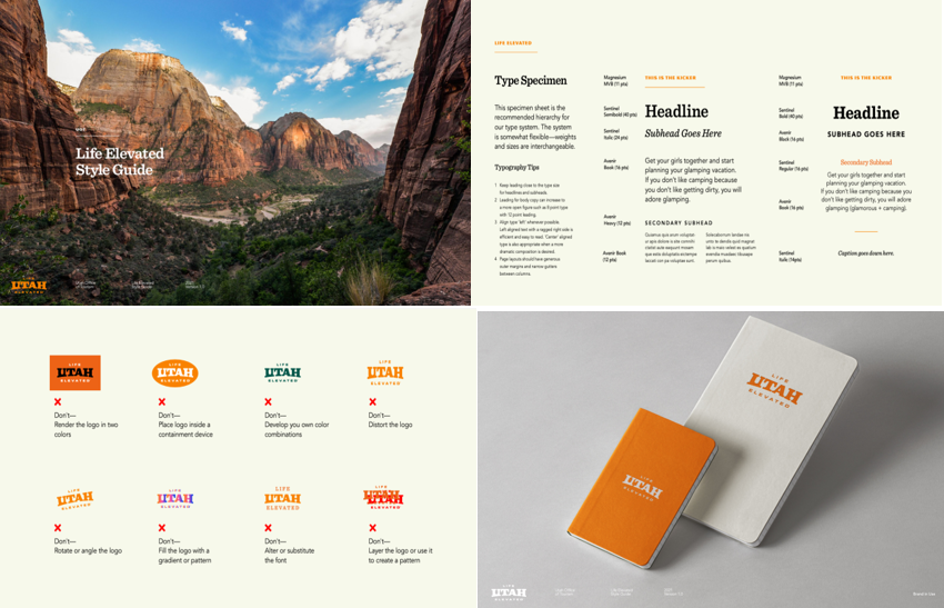
Utah Life Elevated® Style Guide
The state of Utah is built on a foundation of rock – big slabs of granite and contours of Navajo sandstone. And so is its logo. The Utah Life Elevated® logo evokes the rock formations that dominate the state: strong, bold, and rising up from solid footings. The letters evoke mesas, mountains, and arches – solid and substantial landforms that create the visual rhythms people have come to associate with this place. View the Style Guide.
Utah Life Elevated® Style Guide
Request to use Utah Life Elevated® logos

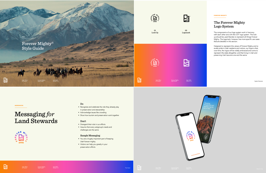
Forever Mighty® Style Guide
Resilient destinations and sustainable growth. Forever Mighty is a position, an initiative, and an ethic. View the vision goals to educate/inspire and preserve/experience both visitors and residents. In short, the elements of the Forever Mighty® identity system will not only be cohesive within the system, they will also link aesthetically to the Life Elevated® and The Mighty Five® brands.
Forever Mighty Style Guide
Request to use Forever Mighty logos